MentorDigital Design system
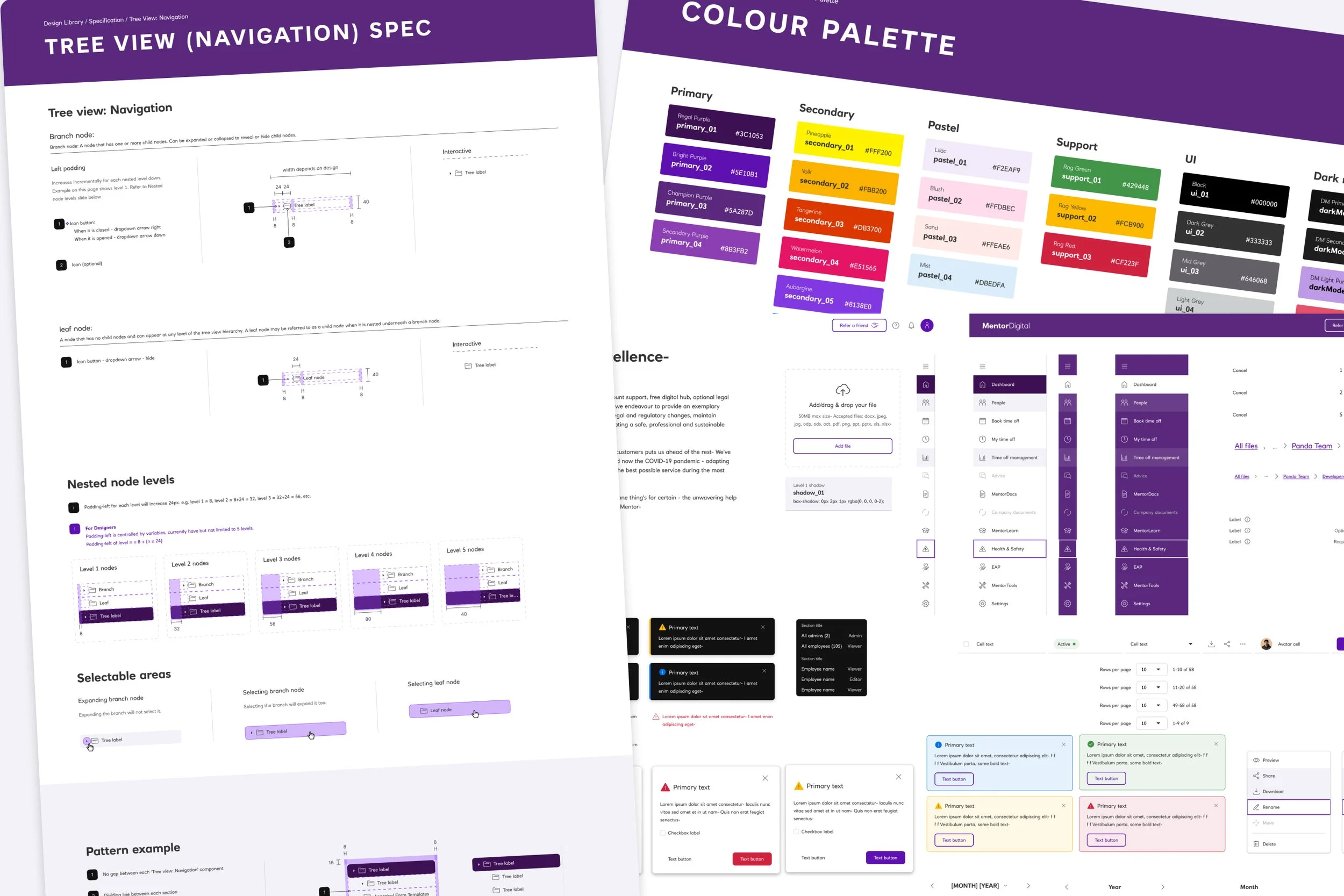
The problemThe company needs a unified, scalable design library and design system to eliminate inconsistency, reduce duplicated effort, and accelerate product development across teams.
Project team
-

Design team
Team of three designers which includes me as lead designer on this project.
-
Software engineers
Team of four developers, one from each squad (four squads in total)
-
Head of product
A sole product owner, balancing this project with other ongoing backglog.
Quotes
“I already have my own small design library that I reuse, but when I’m creating something new, I’m not sure if a component already exists somewhere else. It would be really helpful to have a shared UI library between designers and developers, with common components and clear guidelines for how they should be used.”
— Mid level designer“Our current UI library in the code feels pretty old, and we haven’t kept up with several brand guideline updates over time. With four different development squads working across the product, it’s difficult to maintain a consistent frontend development without a shared reference, so having a proper design library and system would really help align both design and development.”
— Senior Developer“Updating our Storybook components whenever the NatWest groups changes its branding is honestly a bit of a headache. For example, when NatWest and RBS merged under a new set of brand guidelines, it became less clear on how we’d consistently roll those changes out without having a single source of truth.”
— Lead front end developer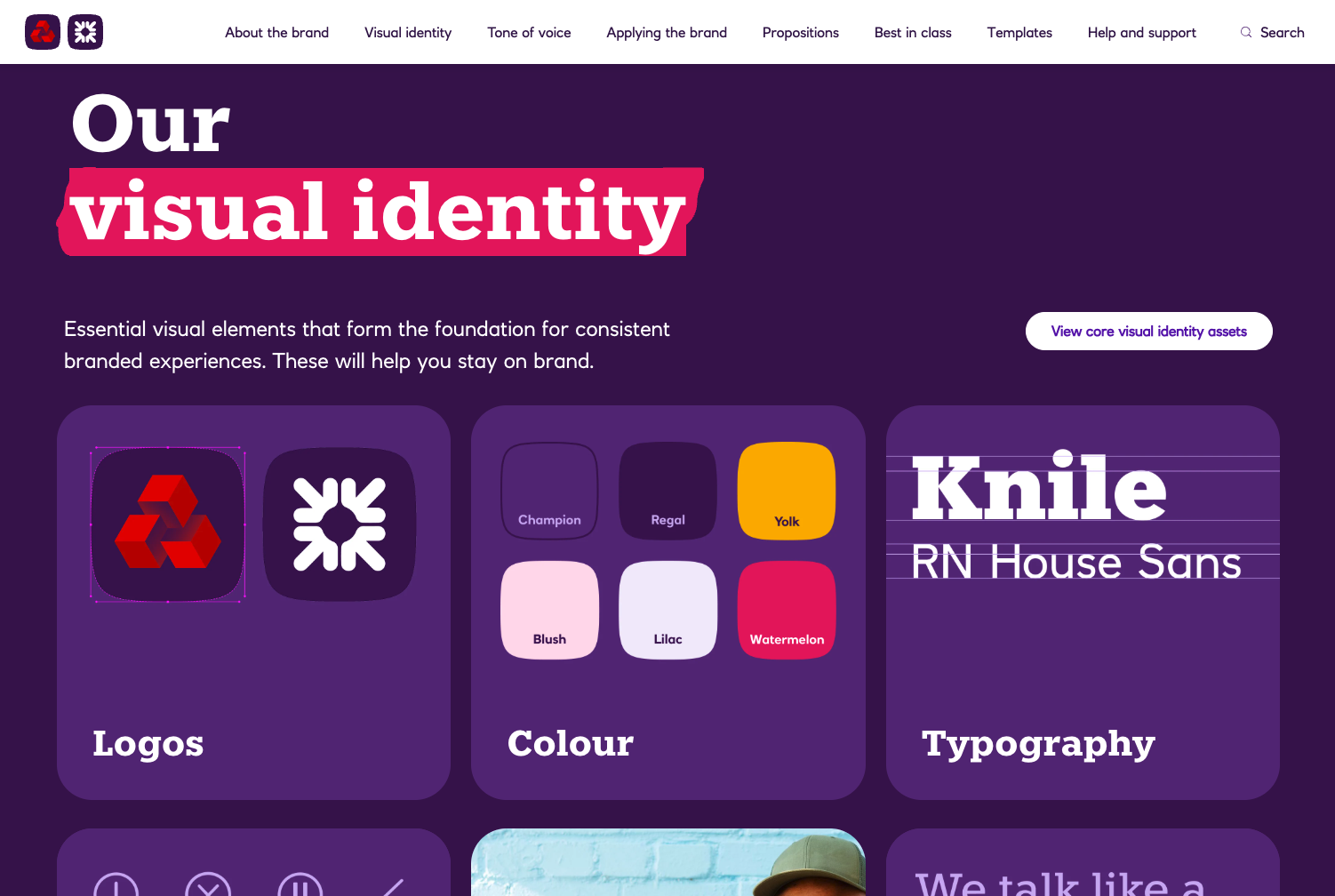
NatWest branding
As part of the NatWest Group, Mentor was not required to fully adopt the parent company's branding. This provided the opportunity to establish a distinct brand identity while still leveraging the trust and credibility associated with NatWest and RBS.
To reinforce this sense of trust, we chose to incorporate elements of the NatWest and RBS brands into the product experience. However, this introduced an important consideration: any future changes to the group’s branding would need to be reflected within Mentor's products.
This became a key principle in the design system's architecture. The system needed to be flexible and scalable, enabling future brand updates to be implemented quickly, consistently, and with minimal disruption across the product estate.
Built in Figma
Mentor's design workflow was fragmented across Sketch, InVision, and Zeplin, with each tool serving a different stage of the design process. One of the key project objectives was to centralise the design workflow and improve collaboration across teams.
After evaluating available options, we migrated to Figma, which at the time offered stronger real-time collaboration, streamlined handoff capabilities, and a more efficient end-to-end design environment. This reduced tool-switching, improved team alignment, and created a single source of truth for design assets and documentation.
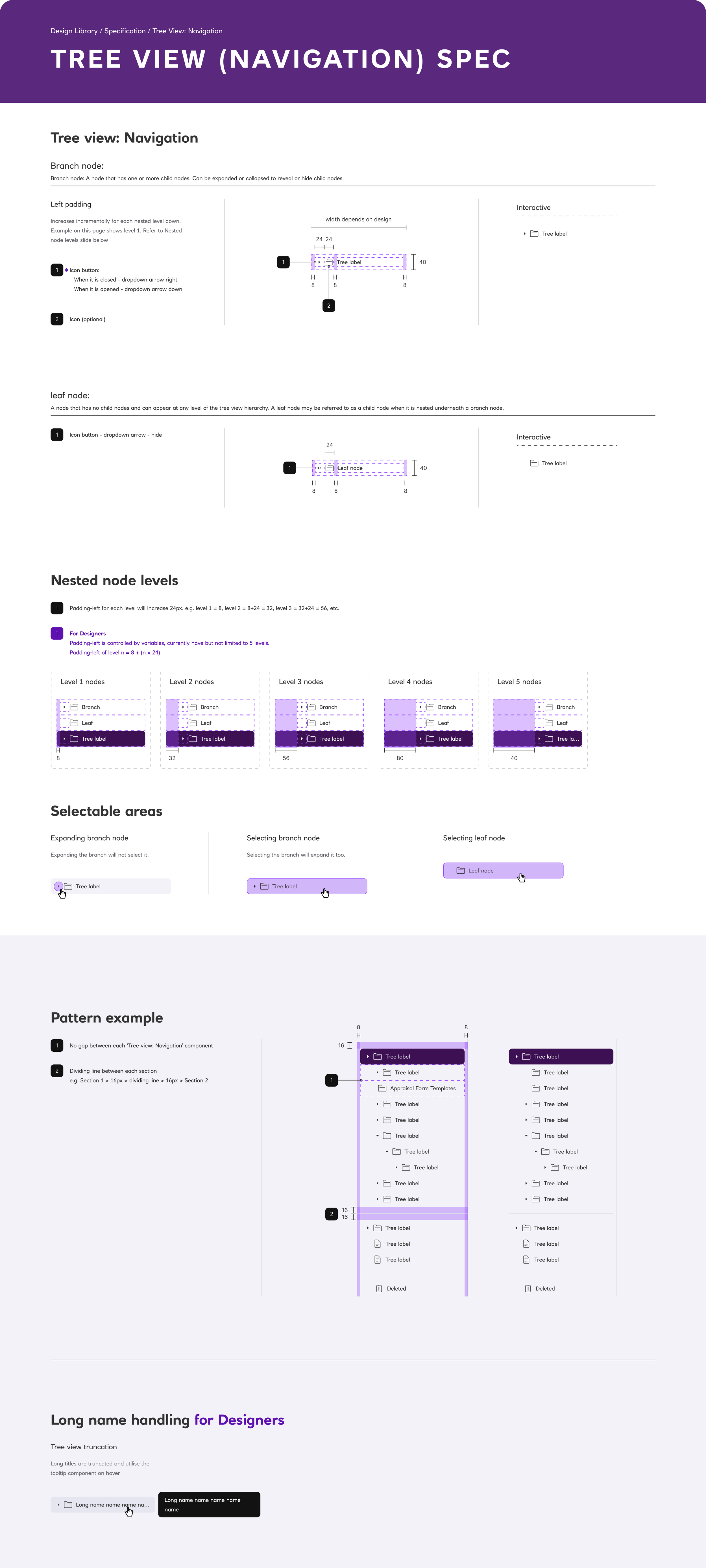
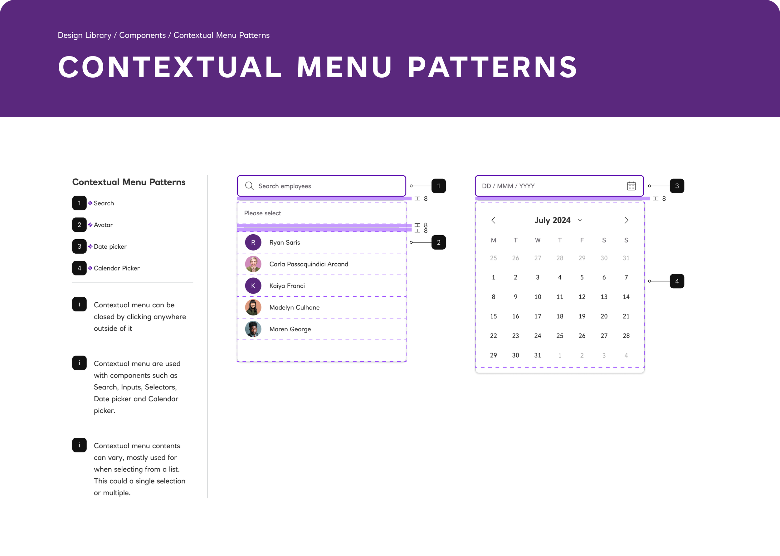
The design library would have reusable components, documented patterns, and clear guidance on usage, accessibility, and implementation. Alongside the component library, governance processes were established to support system maintenance, including component updates, issue reporting, and change management.
Tokens & Variables
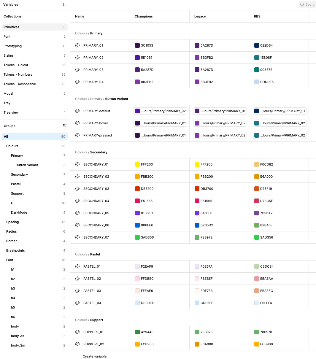
As the component library matured into a scalable design system, we adopted Figma Variables and incorporated design tokens to create a more flexible and maintainable foundation for styling and theming.
This approach separated design decisions from component implementation, making it easier to manage brand updates, evolve design guidelines, and support larger visual changes across the platform. It also enabled the system to support multiple brands and themes through a centralised token structure.
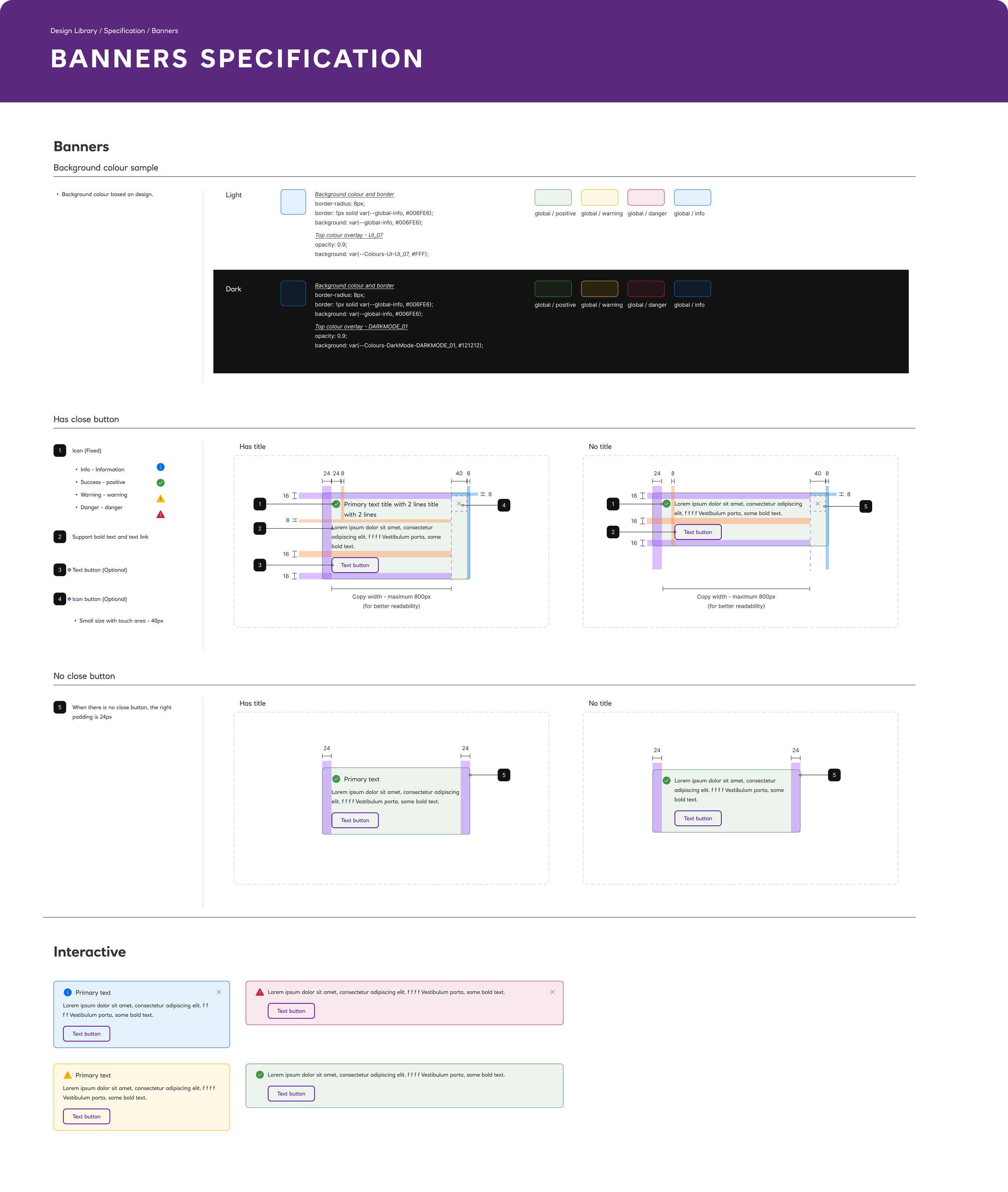
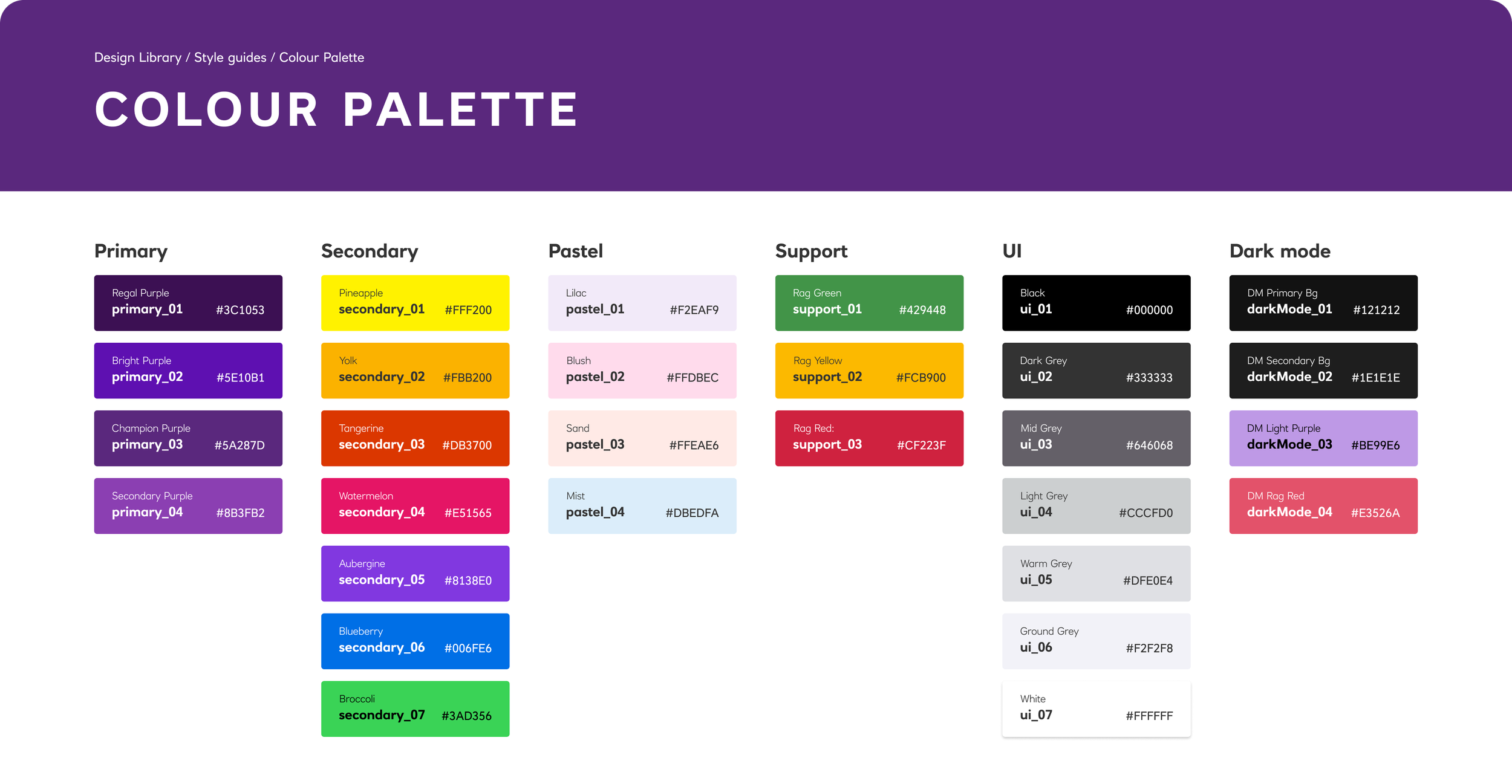
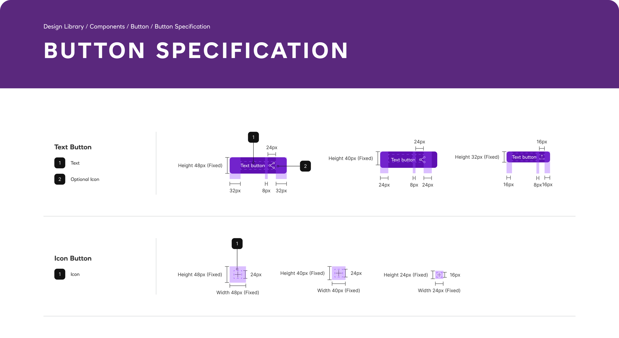
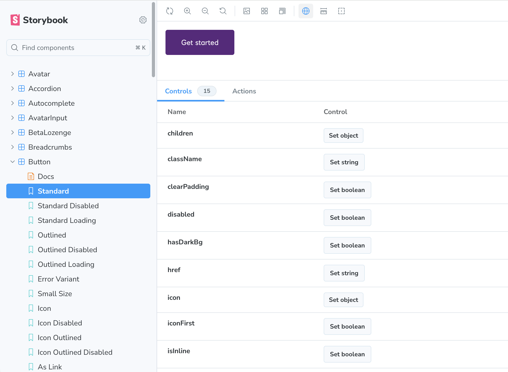
Design system
One of the most significant initiatives was establishing the foundations for a fully scalable design system. While a Storybook library already existed, it contained outdated components, inconsistent patterns, and legacy implementations that no longer reflected the needs of the product estate.
Through close collaboration between design, development, and product teams, we created a new design system that provided a clear and reliable source of truth for both design and implementation.
Beyond the system itself, one of the most valuable outcomes was strengthening collaboration between designers and developers. By introducing a more structured approach to component management and change control, the team was able to improve consistency, reduce ambiguity, and ensure updates were implemented more effectively across all products.