Design Library
By Veygo - Admiral 2022.
The problemThe five-person multidisciplinary design team lacks a single source of truth for UI components, resulting in inconsistent designs and misinterpreted standards.
Bringing design in-house
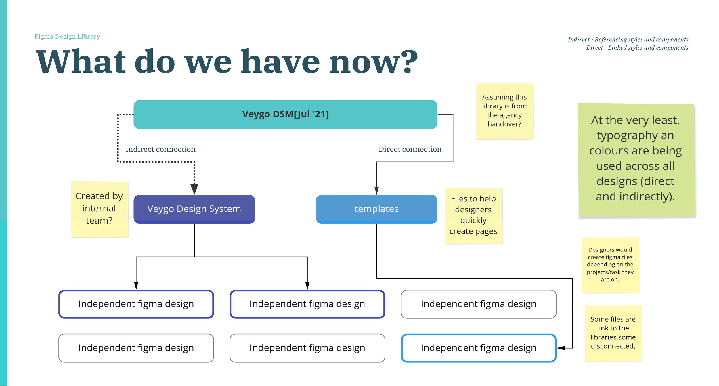
What do we have?
Initial brand guidelines and digital assets were established by an agency before it was handed over to an in-house team in Veygo.
From there, UI designers were responsible for evolving the inherited brand foundations into a scalable digital design library to support ongoing product growth and consistency.
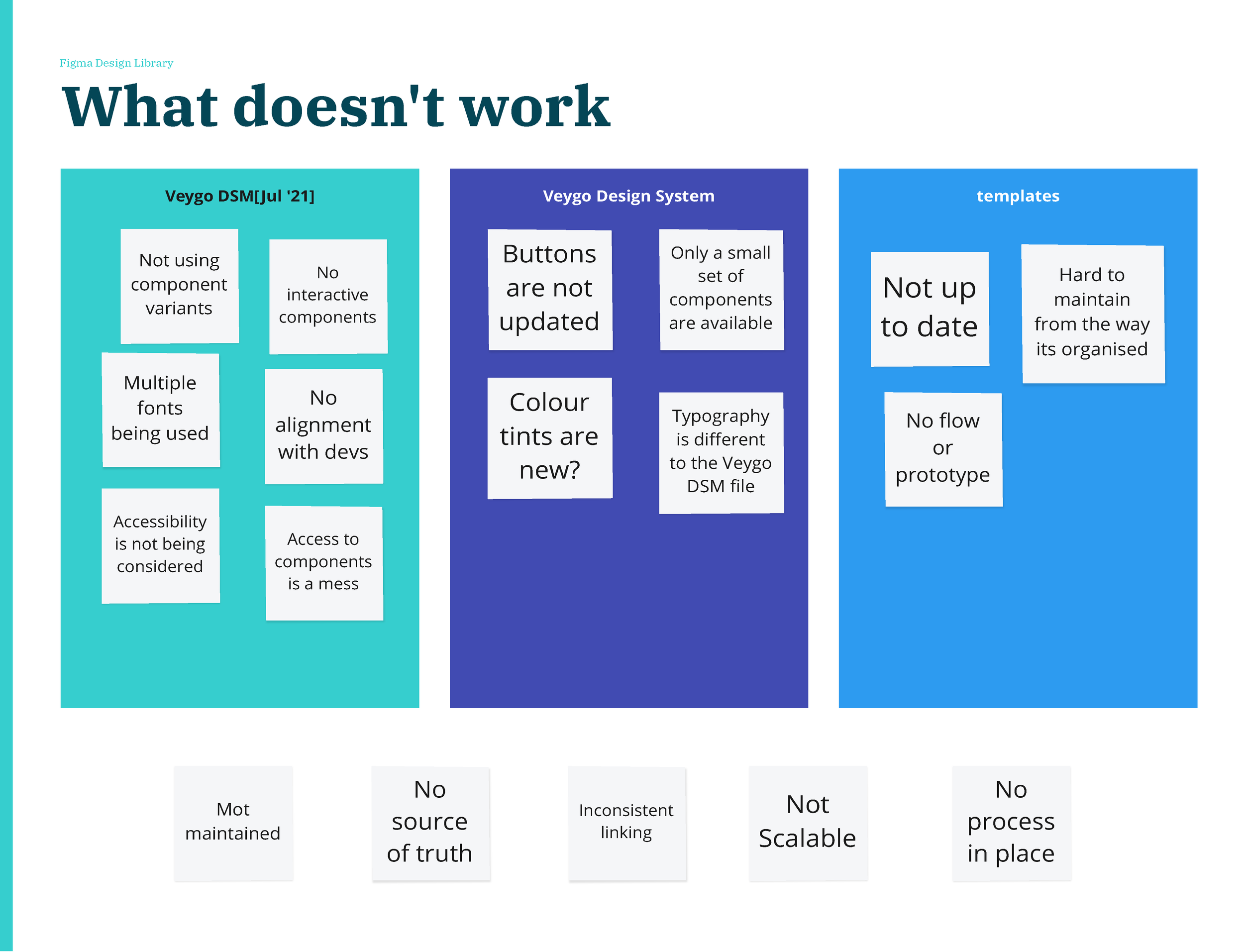
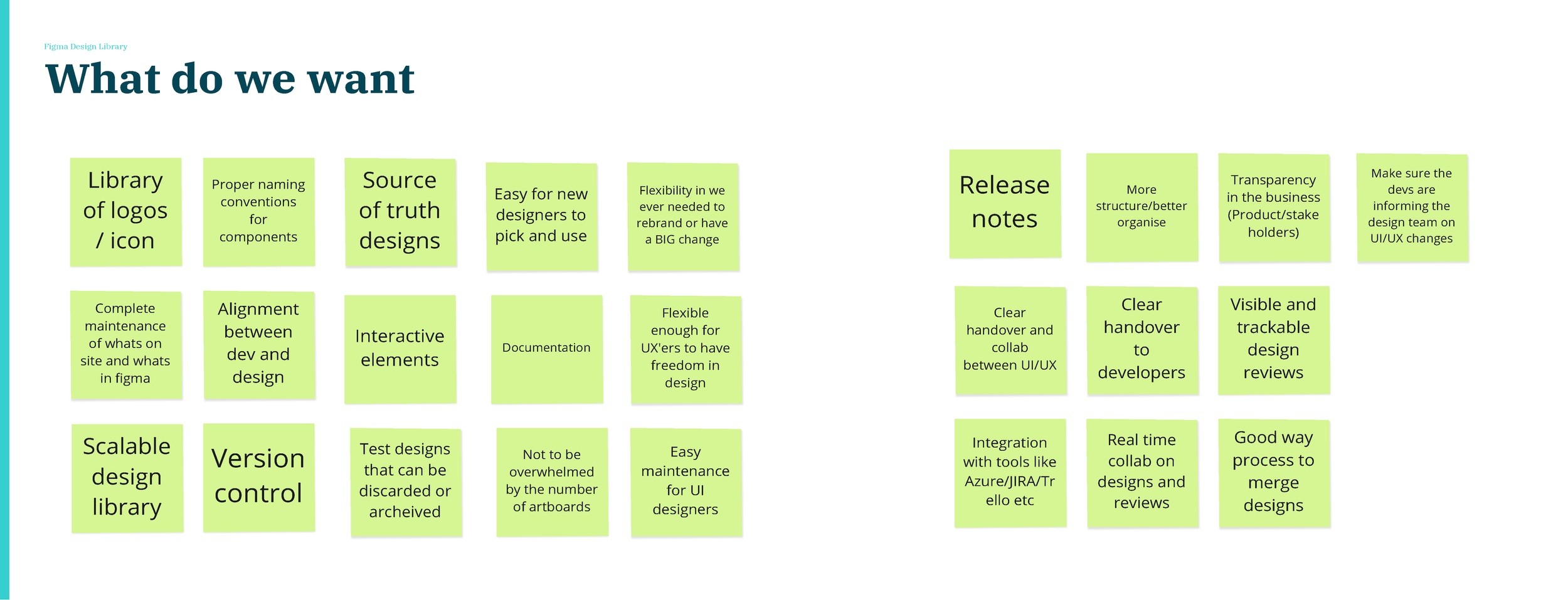
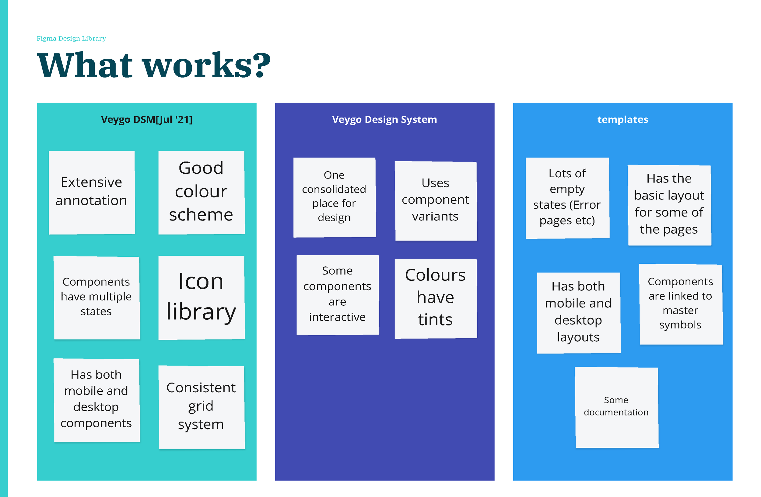
Workshop and discovery
The design team consisted of five designers split across specialisms, with two UI designers and three UX designers.
While UI designers primarily worked within the component library and UX designers used separate tools for early-stage wireframing, a key outcome of the project was to centralise all design work within a single Figma environment. This included moving wireframes into Figma to improve visibility, consistency, and collaboration across the team.
Creating the library
-
Recreate style guides
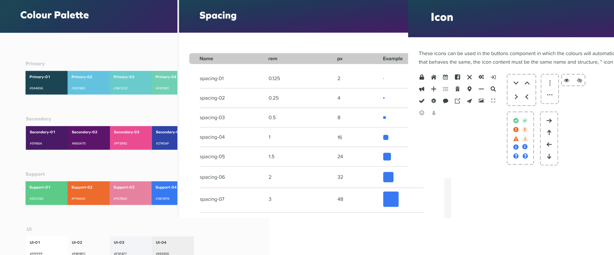
The first phase focused on auditing and consolidating existing design assets. I gathered all visual styles currently in use including colours, typography, spacing, shadows, icons, and logos and organised them within Figma. These assets were then aligned with the existing brand guidelines to establish a consistent foundation for the design library.
-
Build components in Figma
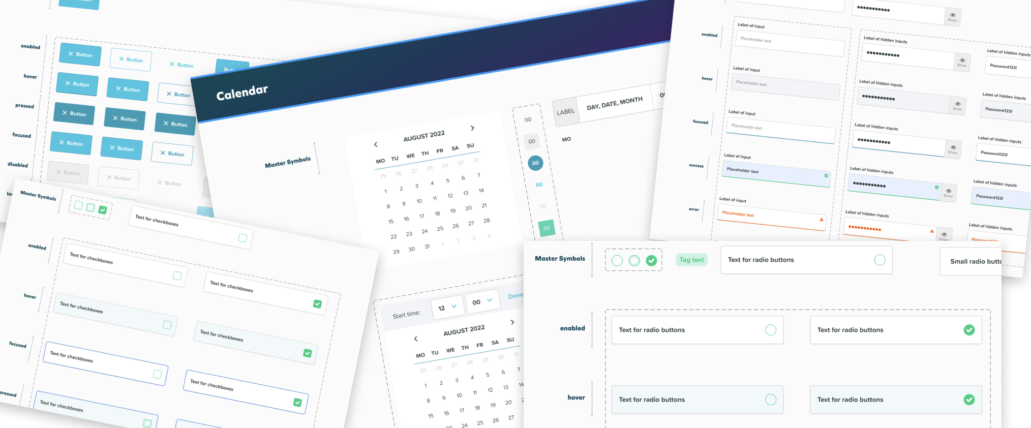
With the foundational styles established, the next step was to audit and consolidate the components already in production. We rebuilt each component in Figma, defining its states, behaviours, and interactions while ensuring alignment with how the components were implemented in code.
A key focus was creating components that were intuitive to use, easy to maintain, and scalable. Where possible, similar components were rationalised and consolidated to reduce duplication and create a more efficient design system.
-
Recreate the product using library
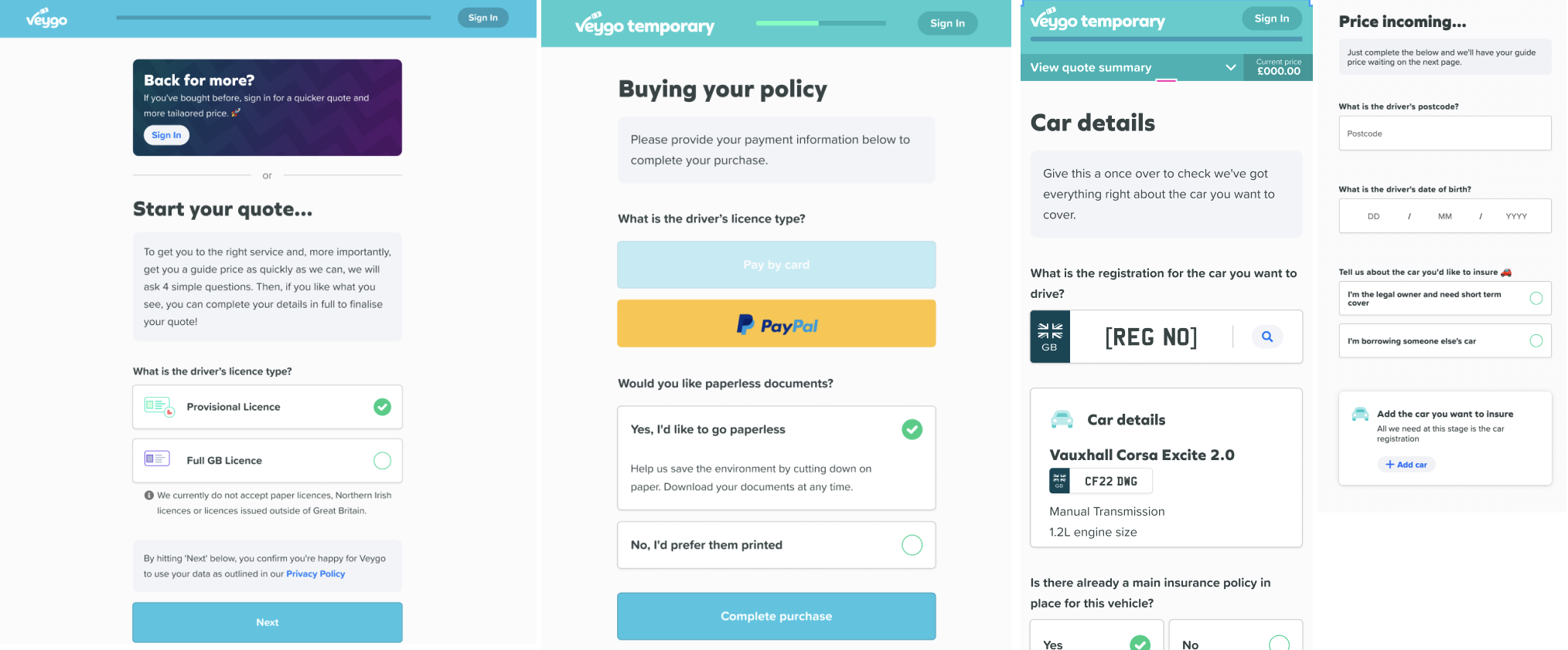
Once the Figma design library was in place, we rebuilt existing product designs using the new components and styles. This helped validate the components in design scenarios which helped uncover components that did not work the way it should. it also gave the opportunities to improve collaboration and establish clearer workflows between UI and UX designers.
Ways of working
-
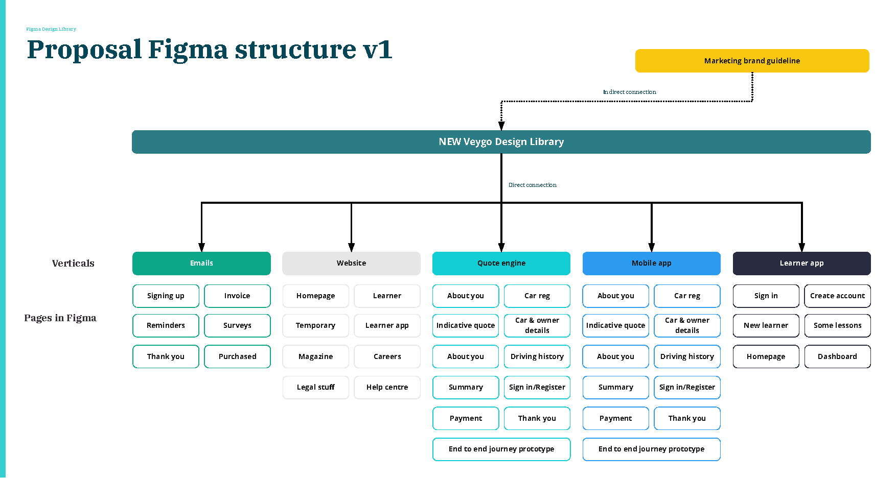
Figma structure
A centralised design library formed the foundation of the design estate, enabling consistent updates across product verticals and ensuring closer alignment between design and engineering workflows.
-
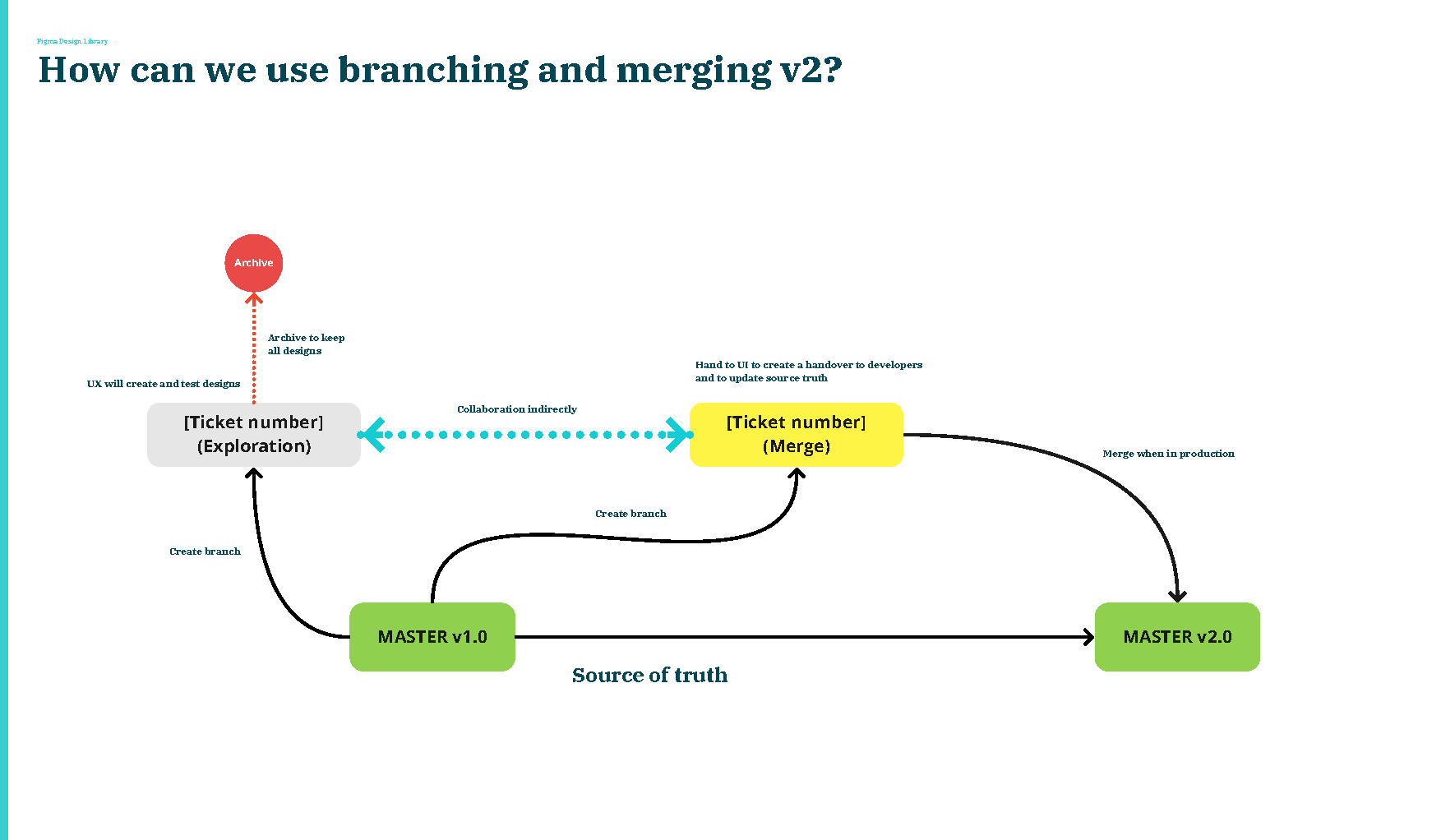
Incorporating Figma branches
With multiple designers often working within the same product areas, Figma’s branching and merging functionality allowed us to explore and iterate independently while protecting the integrity of the the source of truth file.
-
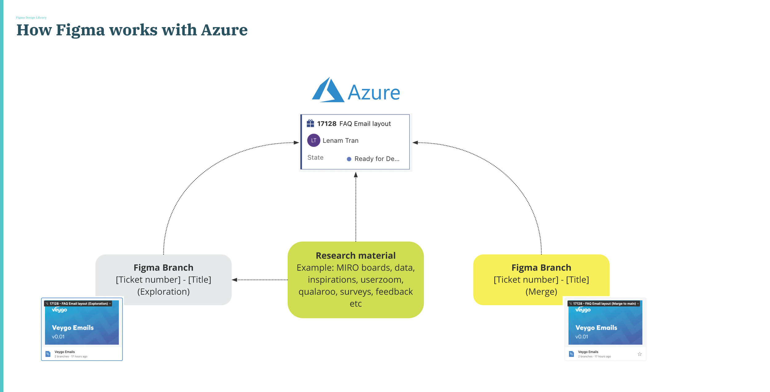
Working with JIRA (Engineering team)
All research, design decisions, and documentation were linked to Jira tickets, creating a single source of truth shared with engineering. This ensured that every feature was fully documented, traceable, and aligned throughout the design and development process.